Branding
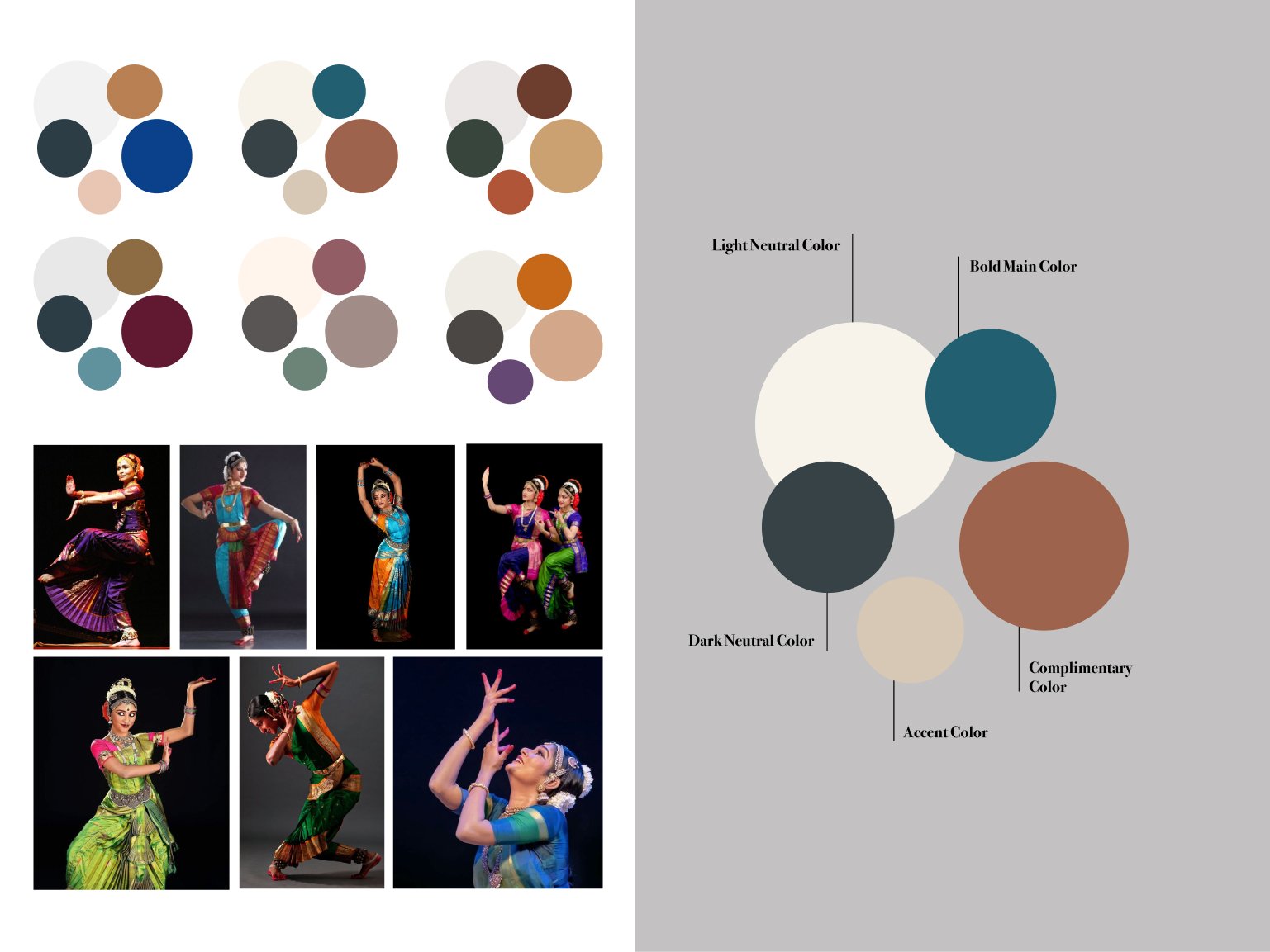
Jwala is a non-profit organization serves to build a community that empowers professional women to continue and advance their passion in Bharatanatyam dance. My first step to developing a brand identity was researching and studying the types of shapes and colors seen during Bharatanatyam dance performances.
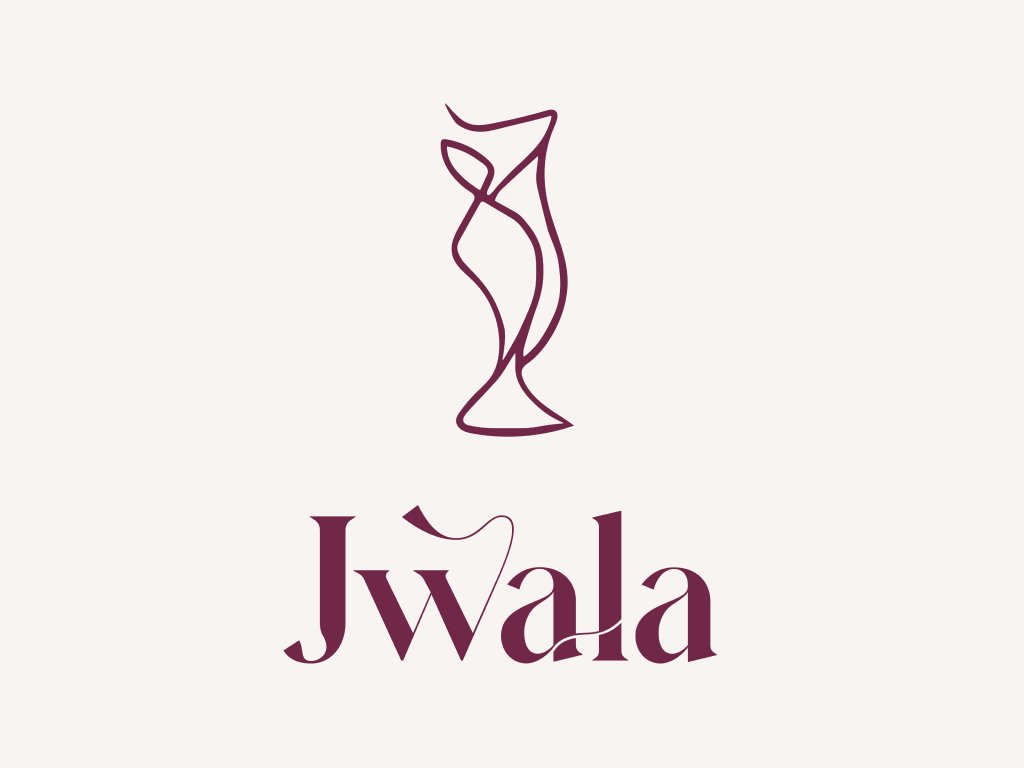
It was important to incorporate the meaning behind the word Jwala, which means flame, and have the flame be metaphorically ignited by the momentum and creativity.
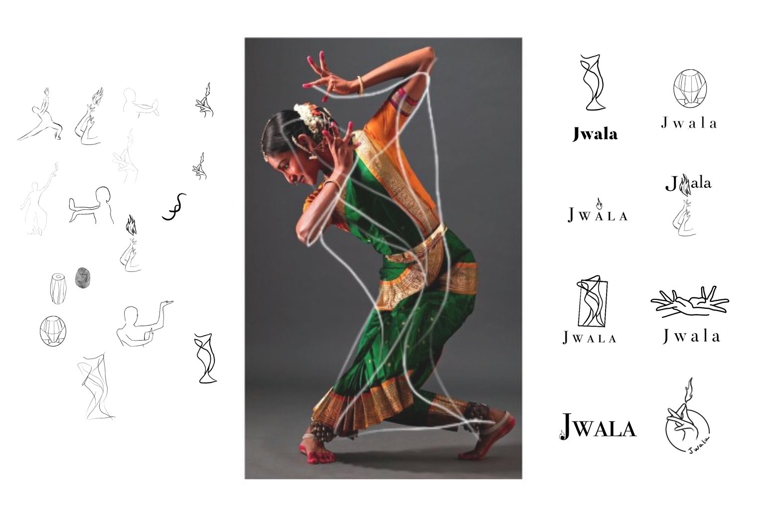
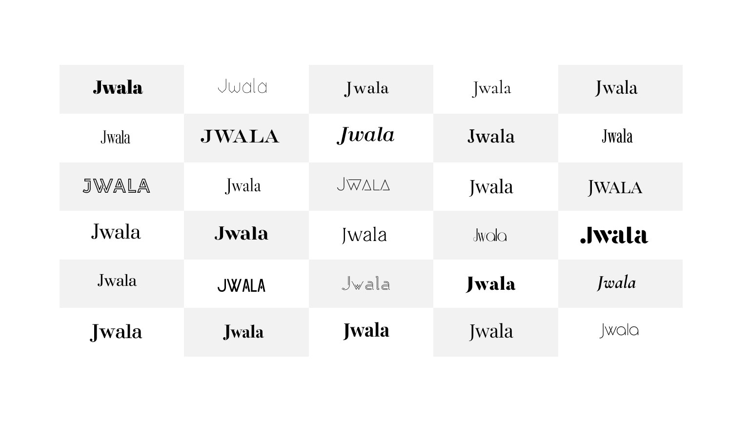
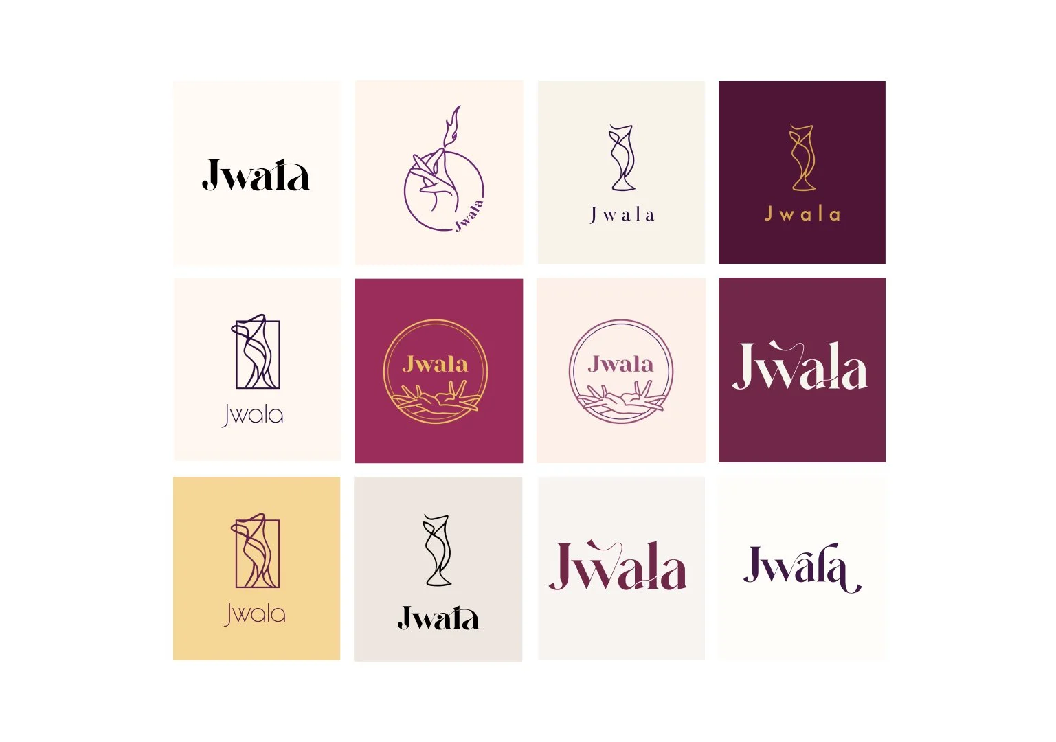
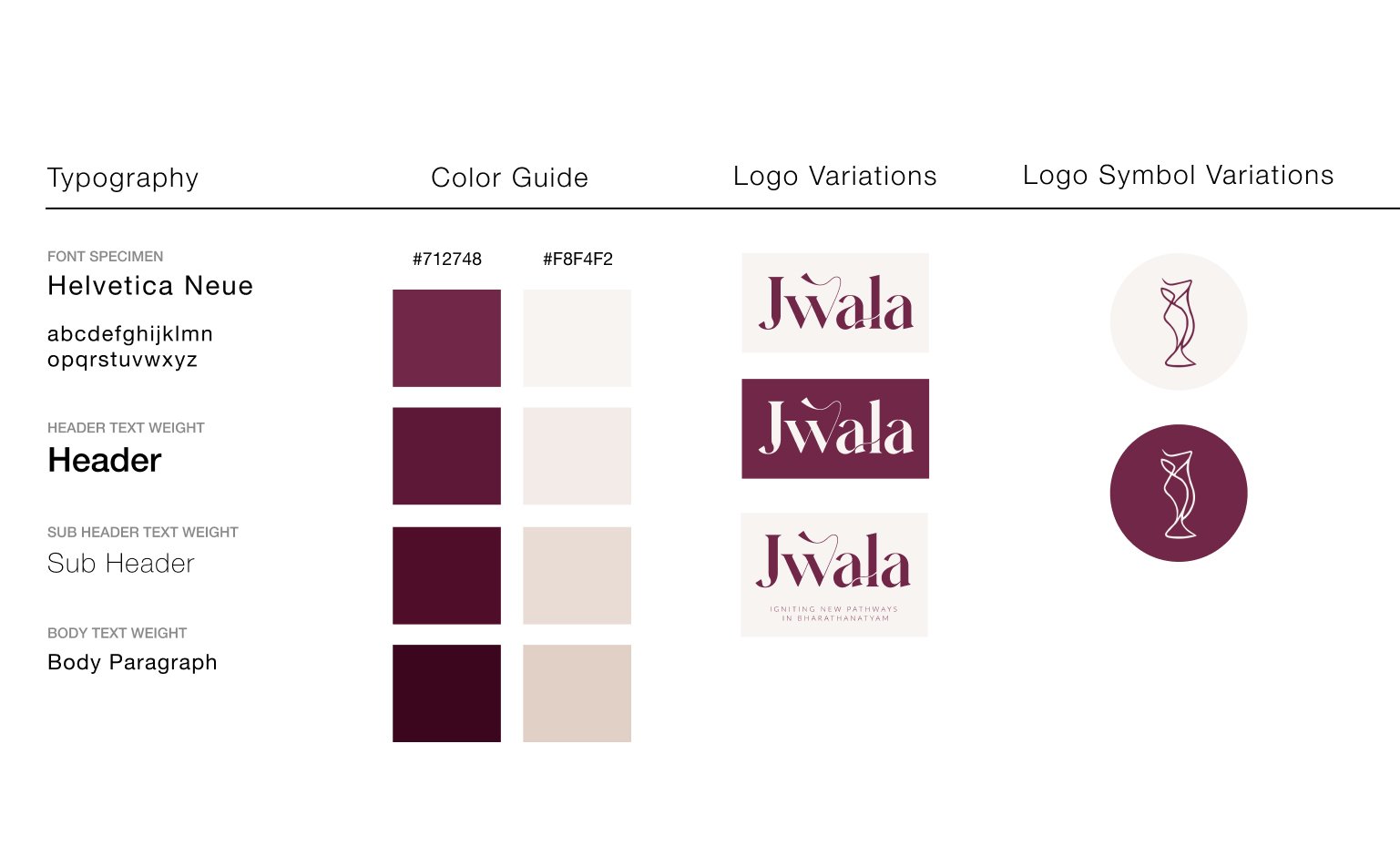
The client favored the vertical, minimalist shape representing a dancer and resembling a flame. I used Adobe Illustrator to utilize glyphs and manually intertwine letters, creating a custom font for the brand.
